
RESEARCH | UI | BRANDING | MOBILE APP DESIGN
CHALLENGE
Bhuku is an app for book lovers to catalogue all the books they want to read, are currently reading, and what’s in their personal library. The app’s features are to be based on user research and testing, and Bhuku also needs fresh branding and a logo. The project timeline was 80 hours over 2 weeks.
SOLUTION
A user-friendly, clean and well catalogued app design that allows readers to easily access all their to-read lists, catalogue their personal libraries, and explore where they can buy their next book. It’s a little library in your pocket.
BACKGROUND
Bhuku, a fictional company, wants to create an app to help book lovers keep track of all the books they own, books they’re reading right now, and what they plan to read next. Inspired by Goodreads, Bhuku wants to give a more user-centric approach to the app, with flow and features based on user research, and fresh design and branding. For my final Designlab capstone, I was responsible for creating the end-to-end mobile app in iOS, starting with research around Bhuku’s competitors and its user base.
Research & Empathize
MARKET COMPARATIVE ANALYSIS, PROVISIONAL PERSONAS, USER INTERVIEWS, EMPATHY MAP
I began by writing a Research Plan to define my research goals, timeline, assumptions, and methodologies. I knew I needed to gather information on Bhuku’s competitors and its user base, and I wanted to get first hand experience with users by conducting interviews. I noted some assumptions I hoped to prove or disprove:
Readers want to use an app to help them manage their reading habits.
Readers want to keep track of their books, including what they want to read, what they are currently reading, and what they’ve already read.
Readers want to interact with Bhuku on a mobile platform.
MARKET RESEARCH
To better understand Bhuku’s target market and its competitors, I conducted a comparative analysis of apps similar to Bhuku, including Goodreads, LibraryThing, and others. Understanding Bhuku’s user base gave me a clear picture of who to interview, and what features are central to the success of these apps. Highlights:
It’s vital for an app to have a strong cataloging system, so that users can list and find books immediately. GoodReads and LibraryThing have strong cataloging systems maintained by user input and seeded catalogue data.
Literature apps that link to another social network, such as Facebook or Twitter, make the signup process more streamlined, and provide a connection to link with friends who are already on the platforms and share account information, if desired.
Statistista reports that in Great Britain, 47% of Goodreads users are aged 18-34. Of these, 34% are female users. Great Britain has the second largest population nationally of Goodreads users behind the United States.
From the market research, two provisional personas emerged. The Infinite Lister, Marie, is motivated by her interest in discovering new books and keeping a stack of books nearby to fulfill her constant reading habit.
Andy, The Quiet Librarian, reads more selectively, and is focused on keeping an organized catalogue of his book collection. The needs and goals from these provisional personas provided direction for my interview demographic and questions.
INTERVIEWS
I interviewed five people about their habits, behaviors, frustrations, and motivations around choosing books, tracking what they’ve read and want to read next, how their personal book collections are organized, and how they discuss books they’re reading now.
“I really just wish I could have a simple app where I could store a list of to-read, reading, and read.”
“There’s not much that can replace the kind of recommendation where it’s as much about the relationship you have with another person as it is about the book.”
“You’re connecting with the human experience when you read, you become a better human, you learn empathy and how to feel outside yourself.”
EMPATHY MAP & INSIGHTS
After completing the interviews, I used an Empathy Map to synthesize the findings and uncover insights that would help me identify user needs. Drawing from each interview, I transferred important notes and thoughts to sticky notes and grouped each of them around 5 themes: Do, Say, Think & Feel, Pains, and Gains. Grouping quotes from the users helped me to start to see patterns in behavior and habits, and start to see insights around their needs.


USER PERSONA
To keep iteration and design focused on user needs, I developed a user persona around the insights and needs gathered from my research. Margot is an avid reader, who usually has a few books on her nightstand at any given time. Whenever she hears about a new book she’d like to check out or a gets a recommendation from a friend, she jots it down in one list or another. She usually gets around to learning more about the books when she finds the list at the bottom of her bag - reading reviews and learning more, before deciding whether to buy a new book, is an important part of the process. Margot needs to access book reviews from multiple trusted sources. She wants to know her options around buying and purchasing books - is it something she can get at her local independent bookshop, or better to buy on Amazon? She also needs a streamlined way to track what she reads - no more crumpled lists and notes lost on her phone.
Defining Goals & Brainstorming
POV STATEMENTS & HMW QUESTIONS, BUSINESS & USER GOAL CHART, PRODUCT ROADMAP
With Bhuku’s user goals and needs clearly defined through research synthesis, I reframed them as Point-of-View statements and How Might We? questions. By posing these questions I was able to begin to think about solutions. I brainstormed by rapidly jotting down potential features that could answer the user needs I’d identified.
“Users need a streamlined way to track what they want to read because they are often using multiple lists to keep track of what they want to read. ”
“How might we help users streamline their method of recalling books so that they can keep track of books they want to read? ”
A Product Roadmap brought ideation into focus and defined the priorities and features for the Bhuku app, keeping user needs at the forefront. Metrics were added to help track the use of these features.
I compared the business goals from the project brief and the user goals side by side, looking for common direction while also taking into account technical considerations for building the app.
Design & Prototyping
SITE MAP, USER FLOW, TASK FLOW, SKETCHING, MID FIDELITY WIREFRAMES, PROTOTYPING THROUGH INVISION
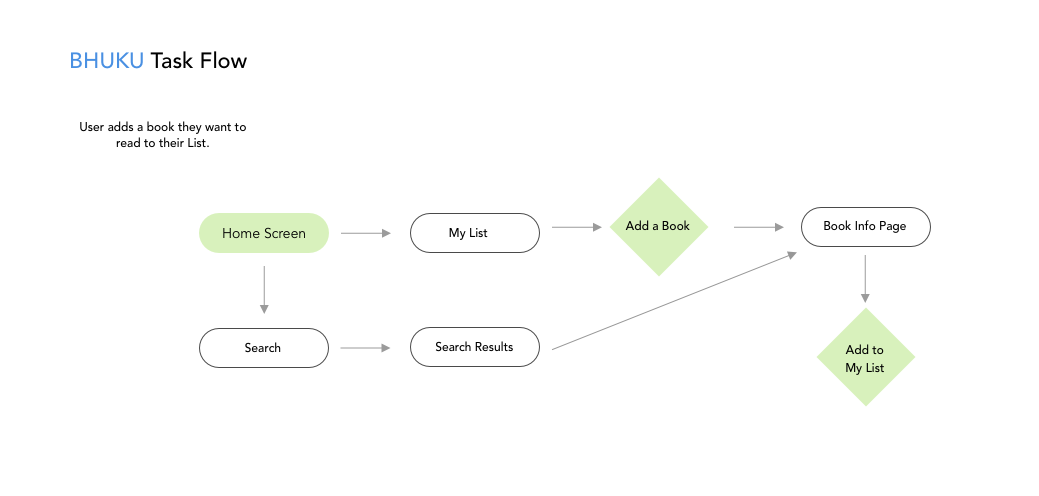
With clear goals and priority features defined for Bhuku, I began outlining the site’s architecture with a Sitemap. I further visualized the outline by creating a user flow and a task flow to help me think about how to organize the app and its screens.


Time to get some screens sketched! I made several low-fidelity wireframe sketches of priority features and the app’s main screens. I continued to refine my ideas and make notes as I sketched.


I transferred my initial ideas into mid-fidelity wireframes in Sketch. I created about 20 screens with the user flows in mind - I needed to create the priority features necessary for user testing and to reflect the user needs and goals I’d defined. After creating the wireframes and screens necessary for flows including notifications and edge cases, I created a prototype through InVision. The prototype is archived at the moment, please contact me if you’d like to see it.


User Testing
INVISION, USABILITYHUB
InVision allowed me to turn my wireframe flows into an interactive prototype with the use of hotspots. For time, I turned to Usability Hub to test the user flows I’d defined. While Usability Hub has its pros, namely time and low cost, the cons are the lack of user interaction, and a missed opportunity to speak more closely with the tester about why they make choices or what they would do differently if stuck on a task. The tests were illuminating, however, and I uncovered some insights which led me to make improvements on the Bhuku wireframes.

Branding & UI
MOODBOARD, STYLE TILE, LOGO DESIGN, HIGH FIDELITY WIREFRAMES IN SKETCH, UI KIT
Pinterest served as a useful resource in gathering inspiration for Bhuku’s branding. I created a moodboard and began thinking about the brand and logo by writing down adjectives as brand attributes.
fresh. organized. modern. classic. clean. book icon. dualtone logo. playful. light. serif wordmark. harmonious. inviting.
I made some sketches for the logo on paper, and was drawn towards a simple, two-tone logo with an open book icon. I designed several versions and tried a few different wordmarks before settling in on the logo in a blue circle container. I tried the logo at several sizes for responsive scale, and put together a style tile with a potential color palette, typography, and book images.
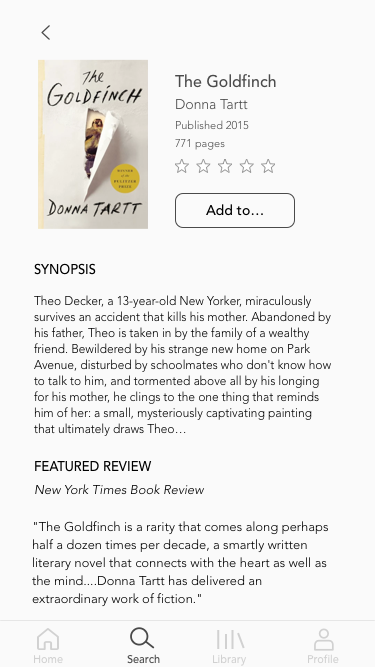
Bhuku is about books, and it’s about accessing your library in the way you want. I wanted the book covers to be the central visual element, so the UI needed to be simple but strong, like a good bookshelf. Pops of color in blue, green, and turmeric yellow lend a gentle playfulness.


Once final design selections were complete, I moved into upgrading my wireframes into high fidelity designs.


Summary & Takeaway
Given more time, I’d send the designs through another round of usability tests. I also found it a challenge to incorporate one of the features I’d identified as a priority user need - the ability to access several reviews from trusted resources. This presented a technical barrier, as linking to many other sites would take the user out of the app. Leaving the app repeatedly distracted from the main priority, to help users keep their reading lists and records organized. Ultimately, I decided in favor of Bhuku’s strength as an organizational tool. This project presented me with the opportunity to design an app from the ground up, based in research and user needs, and create an original design to help book lovers keep their reading wishlists and libraries in their pockets.